


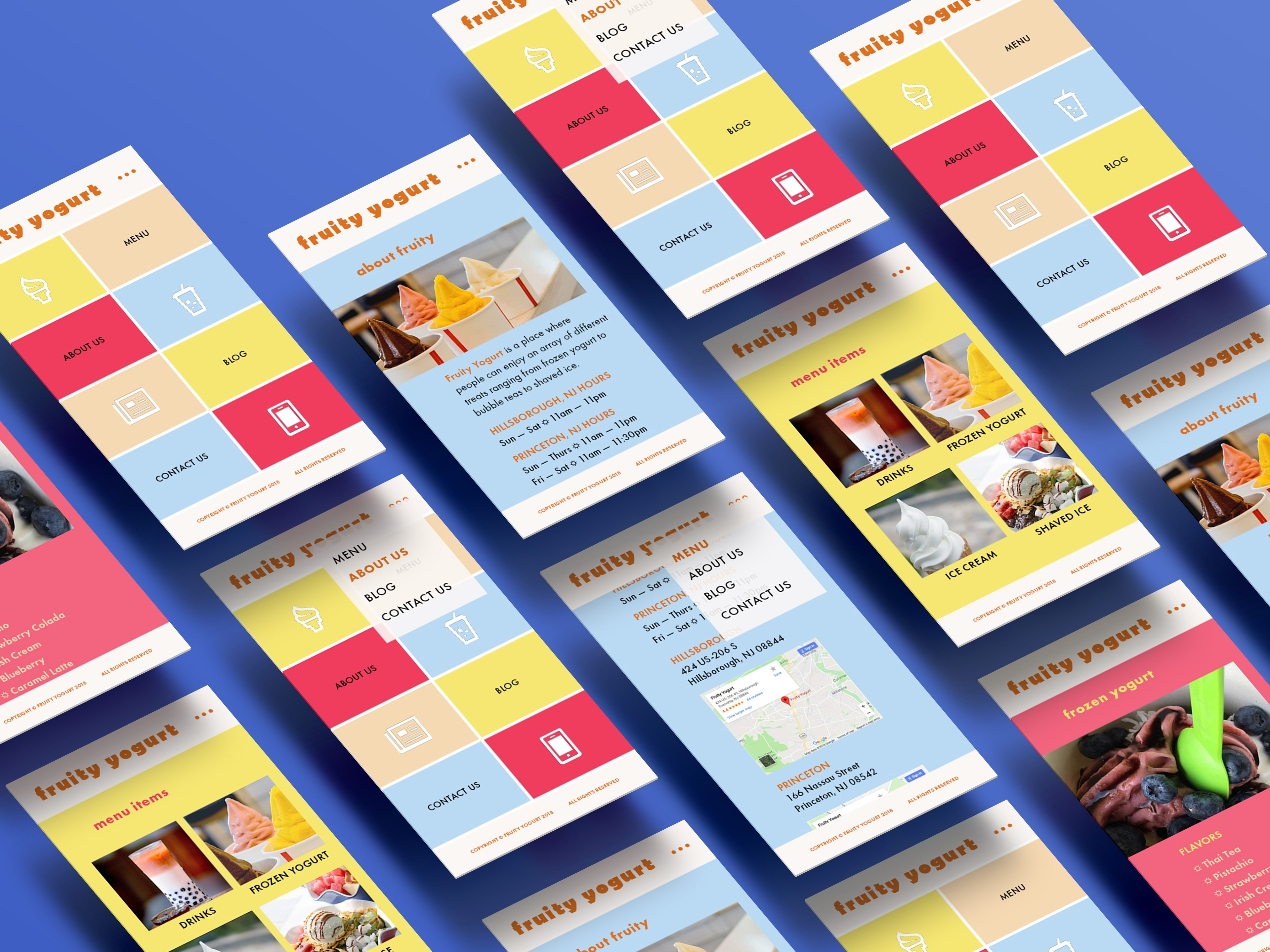
Selecting a preexisting café website, I had to take their content and redesign it into a modern theme with a fluid layout for both desktop and mobile devices. With keeping the site user-friendly for new and returning customers, I kept the display mode for mobile large enough to accommodate for finger tapping as well as keeping things simple for load time. The desktop had more photos to display, but the color motif kept both platforms cohesive as one unit.


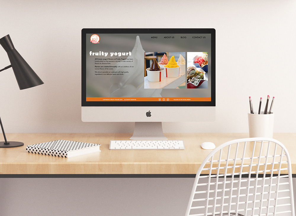
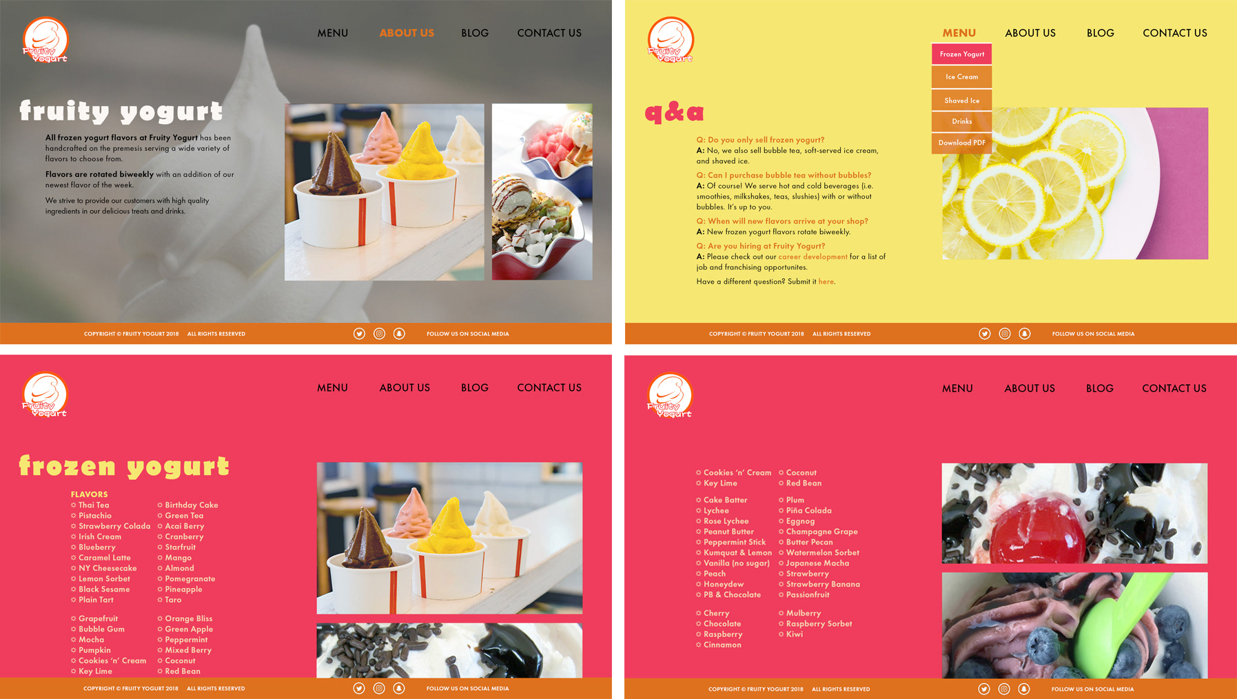
I wanted to keep the theme playful and colorful as Fruity Yogurt's store interior was just as colorful. Their main colors for their logo was orange, so keeping that consistent throughout the layout tied everything together. I also opted for a wider width to accommodate for different screen sizes since the original site had a fixed width. The playfulness also appeared in the display typeface where it added more character and charm to the site. There was also a nice contrast between the saturated background colors and the images.

Other Projects